Monday, December 13, 2010

Final Project

The project and write-up can be viewed here:
https://www.msu.edu/~orthwhit/photography/

It does require a facebook account.

Thursday, December 2, 2010

Constructed Reality Part 2

Images 1 & 2
People liked this image a lot, people seemed to understand that the concept was about the use of windows, however not much was talked about in regards to the concept. The patterns and contrast were working well, but I should have lightened the image a little more because it printed really dark. For expanding this image, I could continue to take pictures of reflections in windows, but instead of having more urban buildings, I could show a forest or something. It could be about the city reflecting what it had destroyed to be build.

Image 3: Urban Sprawl
The concept about this image wasn't discussed, so I'm not sure if people took it how it was supposed to be or not. It was said that the contrast and the texture of this image was working really well. There were no suggestions for improvement. If I wanted to expand this image into a series I could put other urban (or suburban) objects like a mailbox into other natural scenes.

Image 4: Gender ROles
People picked up on the concept of this image exactly, probably because it was so blunt. However, one person thought that I was focusing too much on only the female gender roles, but I wanted to make it clear that there were two roles that I was really displaying at once. I'm not sure how I could make this more apparent. If I were to reshoot I would probably clear up the focusing issues that the pictures have. I could expand this image by doing other gender roles and switching them.

Final Project Concept Presentation


Examining how people construct their identity on in photographs.

This will be similar to my facebook images from the social media project. The images will consist of two photos, one that is set up how a stereotypical profile picture is set up and then another photo of the scene and context of the photograph. I'm basing my images on actual profile pictures from my friends' facebook profiles.

In order to push the concept, unlike the images I created for the social media project, I am constructing the scenes much more. I'm also hoping to add a bit of absurdity to the images. For example, one of the images I have taken so far have been based on a profile picture of my sister. I created a space with fake flowers and "grass" made out of a towel, and took pictures where the subject looks like she is outside smelling flowers, but in reality she is inside in a living room.

I'm also interested in taking "stereotypical" profile pictures of myself. I really hate taking pictures of myself, I'd much rather have them taken of me, so these images could explore how awkward and uncomfortable I feel about "constructing" my identity to show to other people.

I'm still not sure how I will combine or display these images yet. I do not think I want to use the facebook set-up like I did in my other images.

Tuesday, November 23, 2010

Constructed Reality: Final Images

Image 1 &2: Structure 1 & 2

For these images I framed the subjects so that the buildings that are reflecting are not clearly understood as buildings. I used high contrast to to see details in the different layers of the images.

Both of these images are about windows, and the ability to see on the inside and the outside, at once.

The first image is really abstract which is much different than what I normally do I think, and I wanted to try to get into taking more abstract images.

Image 3: Urban Sprawl

I framed the image so that the fire hydrant is half hidden, but still in focus. I also wanted to capture a lot of the patterns and texture of the grass because in black and white the texture is so interesting.

This image is about how inorganic material has creeped into even places that are supposed to be considered natural. Humans have altered and disrupted the way that nature looks and lives. My goal for this image was to create an almost absurd space that did not make sense, but also had a concept about it. This work is a similar to works by Earthworks projects, except that the actual object is not made out of natural stuff.

Image 4: Gender Roles

This image is about switching gender roles, I wanted to compare people in different roles than was expected of them. I wanted people to be made aware of how uncomfortable they were when the gender roles were switched, when a man put on lipstick as a way of illuminating people's preconceived notions of gender. I framed the subjects similarly in both the images to create as little change between the two images as possible. I also adjusted the contrast and brightness similarly. This was my first attempt at constructing scenes, it was difficult because my models were slightly uncomfortable and it was hard to get them to act out my vision. This work is similar to Cindie Sherman who also puts herself in different gender roles, however my image has two different people and their interaction adds a new dimension. I wish I could have videotaped the process of taking this image too, because the posing of the models was difficult, and there was a lot of apprehension and awkwardness because of what I was asking the models to do, which I think also adds something to the concept of this image.


Friday, November 19, 2010

Final Project Proposal

I would like to make a longer series of images that related to my facebook images from the social document section.

I would like to take pictures of my friends in poses that recreate a profile picture they have had on facebook. Then pair that with an image that, in an absurd way, parodies how they behave or portray themselves on facebook (or how someone might, it does not have to be specifically about my friends). The series will be examining how a person constructs themselves and their personalities online.

I think it will have a lot of similarities with the constructed reality project as well, because I will have to create almost narratives in my images to show people's personalities.

For example, a profile picture of someone wearing a PETA shirt zooming out to show that they are actually eating meat. Or a profile picture of someone who looks like they are at a party with a friend, but the zoom out shows it is really just the two of them watching tv. This type of thing.

Constructed Reality


My biggest concern for these images is that they "make sense" because that was something that I had problems with last critique. Also, I need to edit the image of the house more, but it is taking a really long time, so I wanted to know if the concept was good before I perfected it.

Tuesday, November 16, 2010

Assignment 4: Social Document Part 2

Image 1: Containers in a Kitchen

The individuals who critiqued this photograph understood that I was trying to convey a feeling of a kitchen. The image could have been strengthened by more images in the series to imply the atmosphere of a kitchen in a stronger way.

If I were to make this into a larger project I could focus on what makes gives different locations their personality and charm, and take pictures of these individual elements to take away the context of the room, but still imply the atmosphere of the space.

Image 2: Hannah

The biggest critique I got about this image was that it was unclear about what the point was supposed to be, and that it was hard to understand what was going on. Apparently the location was hard to understand, and the fact that this image was a snapshot wasn't clear. My choices for the creation of this image were well thought-out and I planned the position and framing with care and really liked this image, so I was frustrated with this critique. Apparently nothing in this image was working well, and the choice of framing and having the figure pose created a lot of pointless ambiguity. I don't think that I would choose to do a larger project related to this.

Image 3 and 4: Facebook Profiling 1 and 2
The text and graphic elements worked well to signal to viewers the point of this image, and it was understood by everyone. One thing that people thought I could do to make it better was to add more extreme poses outside of the profile picture, to add a level of absurdity to the image. If I were to make this into a large series of work I would make a series of profile pictures (and companions) that were really absurd.

Sunday, November 14, 2010

Blog Prompt #23


In daily life, I perform in a couple ways. My job requires me to interact and be friendly to a lot of different people, so even when I'm annoyed or uncomfortable I have to pretend not to be. Also, since my job requires me to give people advice, I have to pretend to be knowledgeable even in subjects that I have no idea about.

A lot of society is constructed because it is based on the media and social networking, both of which are used to make people and things appear to be better or worse than the really are. Even the idea of my "social environment" is constructed because I have many ways to have "friends" who I can talk to, like on social networking sites, but we truly aren't friends because outside of the internet we never interact.

My physical environment was built by humans, so I guess that is the way that it is constructed. The layout of the rooms was purposefully planned by people, and the decorations and layout of the furniture was purposefully constructed by me.

I am pretty cynical, so I view pretty much every thing as constructed or fabricated, even people's interactions with me or information. There are only a couple things I think are real, and that is my own thoughts, and my religion.

I think a narrative tableau could show someone who is trying to pull off a prank getting caught.

I think it would be kind of neat to recreate images (probably really weird ones) with dolls. Like the image we looked at in class that was so strange, with the girl laying face down in the grass. Using a Barbie for that could be cool.


Thursday, November 11, 2010

Photographer Reports

Julia Margaret Cameron
Vivien and Merlin

This image was created as a book cover for Lord Alfred Tennyson's book Idylls of the King. The image is a tableau of a scene from the story. It shows Merlin being enchanted by a "harlot" named Vivien. In Tennyson's story, Vivien enchants Merlin by seducing him and using his own charm to imprison him to her. Merlin will appear dead to anyone else but her.

The image shows this specific scene in several ways, it includes in the background objects that Tennyson mentions in the story, such as the old hollow oak tree. The subject playing Merlin is also positioned to look as if he is in an unnatural trance. The subject who is playing Vivien also is positioned in a way that is very stereotypical of someone putting a spell on someone else.

Cameron uses both specific details from the story and commonly understood poses and expressions to help viewers understand the image as a tableau.

Jan Groover

Jan Groover's photographs are most often still life or landscape. A lot of what is interesting about her photographs are the abstract arrangements of her subjects.

For example, the several images of spoons and forks (all called Untitled) are easily recognizable as utensils, however the way that she has positioned these objects is very unfamiliar and creates abstract patterns within the negative and positive space. Her use of framing also adds to the abstractness because no whole utensil is shown within the frame, and it creates tension in the image.

Tuesday, November 9, 2010

Assignment 4: Social Document

Image 1: Containers in a Kitchen
For this image I filled the frame with my subjects. I also got the camera very close to get unique perspectives of objects from around a kitchen that you might not notice before.

I wanted to show different objects that do not show a kitchen but still present the idea and feeling of a kitchen. I used close-up images of familiar kitchen objects, but did not give the viewer enough context to understand the space these objects occupied as a kitchen.

I was inspired by David Hockney's work and the other artist that Sarah showed in class (the book one that she could not find a website for), so I already had this idea in my head when I started photographing. I picked out which important objects I would photograph from my kitchen, and then experimented with what ones worked. I also experimented with using a collage-type image.

My goal for this image was to try to do a "collage" of sorts, it is a type of photograph I have not yet attempted. I really liked the way that these types of images looked by the professional artists.

Like I mentioned before, I was really inspired by these two other artists. I think my image offers something a little different because both of these artists use collage techniques to show more context (by creating a space), which I have not done. It is definitely an image that is anthropological, it is showing what a kitchen is in my culture.

Image 2: Hannah
This image is a snapshot. The image was carefully framed with the subject in the foreground and most of the background eliminated. I thought that the background might draw too much attention if most of it was shown.

The image is about the subject, Hannah. I told her, I was going to take a picture of her, and that is how she posed. I believe the image shows a lot about her personality and also a lot about the environment that she lives in, because you can see in the background her bedroom.

It was a snapshot, so I did not do much in terms of method, I just told the subject that I would take a picture of her. I used overhead lighting.

My intention for taking this picture (and the others related) was just to show my friends and how they behave in their "natural habitat".

This image relates to Martin Parr's work, because he also takes images of people just doing what people do. My perspective for this image is slightly different because I have a friendship with the subject, and tried to capture the essence of her in a slightly more deliberate way than just taking shots of strangers.

Image 3 & 4: Facebook Profiling 1 & 2

Both of these compositions include two different perspectives of a subject. Each composition includes an image where the subject fills the frame and also an image where the subject is only a small part of the frame.

Both of these compositions are exploring the absurdness of the idea that you can really know and be friends with someone through social networking, and more specifically that you can really know who someone is by their profile picture. For these compositions I took pictures of the subject in very typical profile picture poses, and then zoomed out to give this pose more context.

For these compositions I used the new lighting technique to bounce light to both sides of my subject. I also added text to the image for the first time.

My goal for this image was to be a little funny, but to also make a statement about social networking.

I'm not sure how my photos compare to other artists. These photos definitely make a social statement, and maybe even an anthropological one as well.


Tuesday, November 2, 2010

Assignment 3: Place Write-UP Part 2

1. Onlooker
People interpreted this image differently than I imagined. I got several suggestions saying that I should make the horse and carriage and the boy more of the focus of the image so that the image would become more about the . To do this, I might crop out more of the sky and grass.

If I were to make this image into a larger project, I would try to take pictures of people in different locations from far away to examine their postures and the relationship of movement between each other.

2. Duality of Suburbia
During the critique, people understood that the image was about suburban life and the lack of individuality within it. The image was successful in being interesting, however it was said that the sidewalk patterns gave away the fact that it was edited. To expand this image into a bigger project I could take most pictures in neighborhoods looking for things that are identical.

3. Preservation Area
People understood that the image was ridiculous but they did not understand that I was trying to make it seem like the sign was for the neighborhood. I believe I lost some of the midtones when I printed the image, so I think I should try to make the contrast less extreme. I could expand this in way that is similar to image number two.

4. Structure
People could understand this image as well, most people thought it was about man-made objects. In order to help push this concept I should straighten the building in the frame, and get rid of the tree.

In-Class Critique


Thursday, October 28, 2010


I chose to recreate an image that one of my friends had posted onto facebook. The comments were really what made this picture so memorable. This original photo was an image that was documenting forever this public humiliation that this person went through after getting too drunk, and promoting this humiliation in an even more public area (facebook).

My recreation image was attempting to take this idea of publicizing humiliation, but tried to show that this person passed out alone doing homework. Many images like the original are both humiliating to the subject but also seem to make the subject more notorious, but an image where someone is passed out from staying home alone and studying would not have this same "cool" feel, and wouldn't be posted to facebook.

Tuesday, October 26, 2010


Image #1 Onlooker

In this photo I wanted the place and landscape to be the focus of the photograph, which is why the landscape overpowers the individuals in the image. I included a lot of the sky in the frame to add balance to the image. I wanted the image to show change, so I made the image slightly blurred.

This image is about reminiscing about the past. The horse-drawn carriage is an old-fashioned object, and the lone boy standing looking out on it seems sad and forlorn. The blur also gives the photograph a more old-fashioned feel.

I did not plan this image, I wanted to take a photograph of the landscape, and the carriages and people kept getting in the way. After a while I decided that I needed to work with these objects in the photograph. I manipulated the image to get rid of another child who was sort of near the little boy, because I liked how creepy the boy is standing and wanted him to be the only standing person in the photo.

I did not have a specific motivation for this image, but just that I wanted to show this landscape.

I really liked the photographer that we watched the video about (I cannot remember his name anymore) but he photographed people who were tiny in the landscape, I think that this image is similar to his work, however it is a much smaller image and it is natural.

Image #2 Duality of Surburbia

I wanted to have an image that contained a lot of symmetry, in order to achieve this the subject of the photograph (the identical mailboxes) are framed in the exact middle. Also, because of the symmetry I made the image have a lot of contrast in order to ensure the image was still dynamic.

My intention for this image was to be commenting on the lack of individuality within “surburbia”. I created an image that has repetition of architecture and landscaping to show how everything looks the same, but also mean for that concept to be taken further to illustrate how even people, world views, and culture in surburbia are often identical from house to house.

When creating this image, I knew that I wanted to photograph a suburban neighborhood, but as I photographed that place I came across these mailboxes. At first I was interested in only the identical nature of the mailboxes, but then wanted to have the yards behind the mailboxes be identical. I had to edit the picture to make the yards identical. This was my first attempt at seriously digitally manipulating a photo.

My intention for showing this image was really to show how creepy these suburban neighborhoods really are, the lack of personality in houses and yards.

The neighborhood reminds me of the book A Wrinkle In Time. There is one place in that book where all the houses look identical, and all of the people in the neighborhood do the same things at once. It is because the people in this community are all controlled by one brain. When I was photographing this place, the book was kind of my inspiration and I wanted the photo to convey the same feeling and ideas that the book conveyed.

Image #3 Preservation Area

For this image I wanted to include the sign as the subject of the photo, so I photographed the sign from a lower perspective to make it look larger. I also included the creepy neighborhood (previously mentioned) in the frame, to make the image seem ridiculous.

I wanted the image to show how ridiculous suburban areas are and to have the sign seem like it is saying the “preservation area” is the neighborhood. Perhaps saying it must be preserved in its perfection.

It took a while for me to get this image right, I knew I wanted to get the creepy neighborhood in the background, so I had to experiment with perspective.

Showing how ridiculous both the sign and the neighborhood was what motivated me to capture this image.
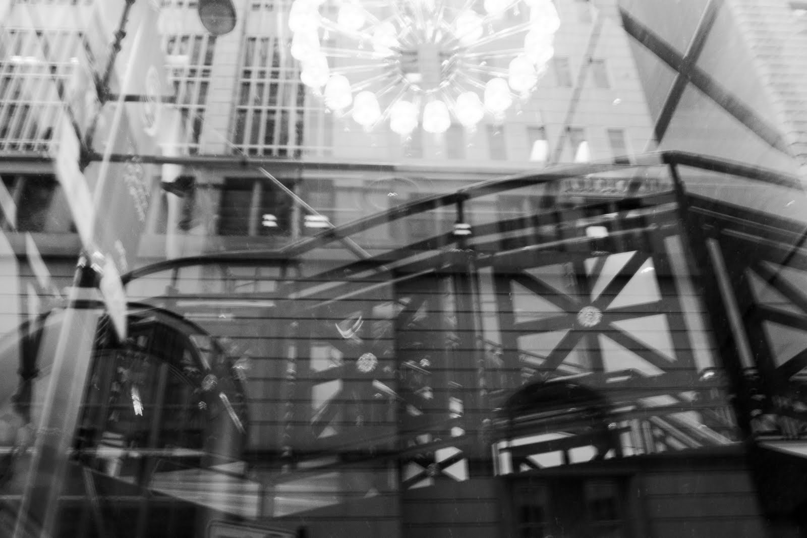
Image #4 Structure

I really enjoyed the form of the stairs in the building, so I wanted this form to be the main subject. To do this I left most of the other surrounding objects out of the frame.

This object is really just about the beauty of man-made a structure. The almost complete lack of organic objects helps to reinforce this idea.

I had previously sketched, dreamed, and analyzed carefully how I could take this image. I have been in love with the pattern of the stairs for a long time.

My motivation was purely to show the patterns that I thought were so cool looking in an image.

This image relates to another one of the photographers we watched in a video, the one that blurs architecture to show just forms. Though this image is not blurred the focus is on the patterns and forms within the building instead of the actual building.

Tuesday, October 19, 2010

Research about Place Photographer


http://www.whitecube.com/artists/taylorwood/

This image called Self Portrait Suspended seems to be about the confusion of space and how it relates to a person's identity.

According to White Cube (where I found part of this series) Sam Taylor-Wood's work "examines the split between being and appearance" and places subjects "where the line between interior and external sense of self is in conflict". I think this image in particular is about how someone feels on the inside (suspended and waiting, or weightless and relaxed, or even just something different and unexpected), and how this "inner person" can really be a problem if it becomes apparent in the real world.

The place in this series of suspended self portraits seems quite important, because it adds a sense of inconceivability to the image. If the subject was in another place, like outside a large sky scraper or on the moon or even cliff diving the subject's pose would be much more understandable. However this white room, this space, though not directly the subject becomes an integral part of the meaning of the image. How would the subject be falling or suspended like she is in the image in this space? So I think it is really an effective depiction of space, because it adds so much to the overall meaning of the image.

Monday, October 11, 2010

Image #1: Triplets

The reviewers thought that this image appeared to be taking away my identity and that it also shows there can be more than one side to a person. This is similar to my original intent, although I did not want to imply to be taking away my identity, but I can see where this idea may come from.

In order to improve my image I should lighten the background more, and also crop closer to the head, so the subject is more centered.

If I was to expand this project, I could take more portraits of people in typical portrait fashion, but block out their face with something that they enjoy doing so much that they may feel it becomes part of their personality.

Image 2: Boredom

The people from class thought that this image was a person who was confused, and was trying to "explore a camera". This is sort of the meaning of this piece, although it was more about boredom than confusion.

Some individuals thought that I should crop the image so that he sat in the middle, although others thought that this position of the subject was a design element that worked well. People also mentioned that his face was very effective.

If I were to expand this into a larger project, I could use a subject as if he is "exploring the camera" by entering the frame in strange ways.

Image 3: Art?

People thought that this image was about waiting, the subject was trying to occupy himself, and that he was not aware of the camera and the photographer was just people watching. It was an image that caught someone at a meaningless moment of their day. This was not at all what I had in mind. Their ideas might have stemmed from the fact that I did not pose the model at all, perhaps if I had posed him in an obviously thoughtful pose, it might be more clear that the photograph was describing something particular about the subject's personality and interest.

The low perspective was working well, however one reviewer said I could maybe push it further by going lower. The contrast between dark and light was good, and there were interesting lines that led to the subject.

If I were to expand this project, I could people watch between classes and take pictures of people who really are just waiting around for the next thing to happen.

Image 4: What?

The only thing that the reviewers thought was that it looked like he couldn't see, and this idea was exaggerated by the fact that in previous images of the subject he had glasses on, and he was not wearing them in this image. In a sense that is what I was going for, I was trying to show someone looking puzzled and uncomfortable.

The expression is working well in this image, as well as the cropping. However I could have played more with the position of the face. For example, the face being upside down, or turned to one side. Also, it should have been sharpened more, and I lost some of the mid-tones during editing or printing.

This image could be made into a larger project that is similar to the one from Image 2, something about exploring a camera.

Monday, October 4, 2010


Image 1: Triplets

For this image I wanted a self-portrait that was more interesting than just a centered shot of my face. I wanted to have the middle image of me centered in the frame, but didn't want to include all of the other additional figures. The repetition of the same figure makes the image very balanced, but the asymmetrical cropping of the two outside figures prevents the image from being too balanced.

The image is about how I see myself. The image was taken of my reflection in the mirror, because on a day-to-day basis I can only view myself through the mirror. The camera blocks my face because I don't really often think about how my face looks. I'm more concerned with things I can change, like my clothes or my hair. Finally, there are multiple images of me because I feel like there are multiple personalities within me (who I am with my friends, who I am in class, who I am at work), and while most people only see my one personality, I can look at myself and see all of these different aspects.

For this photo I brainstormed ideas that I could do for taking a self-portrait. I knew I wanted to do it in the mirror, specifically my bathroom mirror because it has the ability to open in interesting ways. I played around with the mirror's ability to reflect, and how to frame the image.


Image 2: What?

For this image, I wanted to fill the whole frame as much as possible. In order to prevent the image from being boring, I chose to leave certain areas of the subject's face out of the frame. I also was experimenting while shooting the subject, with the type of distortion that occurs when the camera is very close to the subject. This one has some distortion of the subject's face.

The image is about being puzzled and put-off. The subject was uncomfortable because the camera was so close to his face, so this definitely shows in expression. Also, the cropping of his face and the distortion adds to the puzzling effect of the picture.

I did not do much planning for this image. I knew that I wanted the subject's face to fill most of the frame. I also told the subject to "look interesting", and this is what he came up with.

The real goal for creating this image was to create an image that experimented with distortion of the face, and that filled the frame.

Image 3: Art

For this image I took a picture from a lower perspective. I increased the contrast, because there are distinct separations between the white walls and the dark ground, and even within the figure with his dark jeans and white shirt. I wanted to emphasize the figure, so I tried to capture lines that were pointing towards the figure.

This image is about the subject, and his personality. I know him very well, and one of his favorite things to do is look at and discuss art. At museums he takes a really long time looking at one piece of art, and contemplates its meaning and importance. I wanted to create an image that showed his serious contemplation of art.

I did sketch this idea out beforehand, I knew what I wanted the subject to do, so I drew it out before hand to get an idea of what it would look like. I did not direct the subject much, I told him only to look at the painting. I experimented with using different perspectives that I hadn't tried before, mostly ones from below.

Image 4: Boredom

I framed the subject in an uninteresting position, with his head being at the center of the frame with no background. The lighting was also supposed to be pretty generic.

This image is about boredom, so this is why I included such little interesting detail and framing. Both the subject and I were bored of photography by this point, and we wanted to be done. I wanted to create an image that encompassed this boredom.

I did not actually plan this image at all. I was fiddling around with zoom, because that was the prompt and I accidentally took a photo in this way (mostly just the subject's head and a blank wall). I then really liked it, and tried to recreate it. I did not tell the subject to do anything, and would take pictures when he was not prepared, so that he did not look posed.

This image reminds me of Lise Sarfati's images. Her subjects look incredibly bored or like they are waiting for something. However, her images tend to have interesting backgrounds or are made up or posed. My image is really truly an image of my subject waiting for the experience of having his picture taken over and over to be over. I did not edit the subject's face to make him look more idealized, which I think is something pretty different than most images these days. I wanted the image to look real.

Monday, September 27, 2010

Lise Sarfati


http://www.lisesarfati.com/

Lise Sarfati's pictures feature most portraits of people doing nothing. Often times they are sitting in bed, smoking a cigarette, hang off porches. All with rather bored looks on their faces. Most of the time these people are adolescents, and an overarching theme in her work is that these adolescents are trying to find themselves, trying to be something they are not.

In the first image, Sloane #30, stands a girl who had recently had a drastic change in living situation. Her and her sister moved from Phoenix to Oakland, California. In the series of photos of the two of them, they are almost unrecognizable from picture to picture. Each dresses up in bright costumes. In this picture in particular they she has on a wig, and sunglasses that she has dressed herself in.

In the second image, Sloane #34, Sloane is seen looking completely different.

Friday, September 24, 2010

#5
I agree with the quote by Mary Ellen Mark, about being honest about why you're photographing someone. It is important not only because you are taking some of their soul, but you are also displaying that soul to others. People have a right to decide how and if their person is displayed to others.

#6
I think that people are beautiful as they are. No body is perfect, and to attempt to edit someone so that they appear perfect is saying that person is flawed. I also think this directly relates to the Mary Ellen Mark quote, if you are editing someone's appearance it can often times be unethical because you are not allowing the person themselves to choose how they will be seen, particularly if you edit something drastic and do not tell them what you will do.

#7
In the newspaper the portraits are often action shots, someone doing something. Rarely there is just a person looking into the camera to be seen. Normally, the important thing about the picture is the action a person is completing, and not the person themselves. This is different in facebook pictures, the portraits are specifically to show a person as close and as much of their likeness as possible.

Monday, September 20, 2010

Recreate (Portrait)


The original photo is on http://www.timtadder.com/. It is a photograph of two poses of a football player. The image uses a lot of bright whites and is a very commercial looking photograph. Immediately, when I saw this image I thought of my brother (the subject of my image). He is an eighth grader and aspires to be a college football player. He often tries to look like he doesn't care about anything, much like the subject of the original image. I tried to get my brother to mimic the football player's pose and facial expression. I also tried to use the same well-light bright white light that was present in the image.


Written Statement (Part 2): Assignment 2 (Explore)

It's difficult to really write this second part, I did not get a lot of feedback from the review of my photographs. No one really tried to interpret my images, nor did they give me any constructive feedback. It was said that the concept of Illusion (using a mirror to reflect the grass) was working well.

If I were to expand this project, I think I would try to do a larger project using the concept I used in Illusion. Images of nature reflected onto unnatural polluted areas.

Wednesday, September 15, 2010

Written Statement: Assignment 1 (Explore)


Image Title: Illusion, 2010

In the frame I included the entire mirror, and also much of the background of pavement to show the contrast between the grass in the mirror and the pavement. The most focused part of the image is the grass reflected in the mirror, and the rest of the mirror is blurred out, I did this because I wanted the mirror to be less of the focus, so the image just seems to have a patch of grass in the middle of pavement.

When taking this picture I wanted to create the illusion of natural grass on a polluted and very unnatural surface. With the image, I hoped to show what has become of nature, that it is now a world of pavement, unnatural, polluted area with merely mirror-image illusions of nature in the middle of all of it.

This image is a social image. It contains an environmental message that makes people think about their behaviors and also their own views of what nature is to them. Much of Earthwork Art (like Smithson and Turrell) also use the earth as the media to create pieces that make people think about environmental issues.

Image Title: Instability, 2010

For this image, I cropped some of the merry-go-round to create tension, but kept enough of the merry-go-round to see the circular pattern it makes when it spins. I also used a slow shutter to blur the merry-go-round to emphasize the motion.

When I thought about instability, I thought of my childhood how after every time I got off a spinning merry-go-round, I felt the world shift underneath me. That instability always frightened me. I used the merry-go-round and the motion of it to recall the instability I felt when I stepped off, and can relate it to how I now feel I have stepping off of my childhood, and onto the second step of my life.

This piece is psychological, and personal. It explores my current fears with instability by using childhood memories.

Image Title: Repetition, 2010

The image has dramatic lighting in order to bring more excitement to an object that is really repetitive; I also focused on a part of the image that is different from the rest to create more interesting elements.

I constructed the three-dimensional collage with old magazines and old Jones Soda caps that I collected when I was younger, then photographed the collage. I used repetition of the elements to show the vast amounts of objects I had collected.

This is related to Andy Warhol’s works, in particular, his Coke Bottle images, which were full of repetition and have a similar subject. Instead of Andy Warhol’s art which was created with no intention at all, I intended to have my piece function as a social commentary on how much waste humans create.

Tuesday, September 14, 2010

Assignment 1:Explore


Blog Entries #3 and #4

The quote by Duane Michaels seems to be accurate to me. Photographers search for the "right" moment or "right" scene to capture. Most pictures are well-thought out and planned. Even people who are not professional, not adjusting shutter speed or light, are still perfectly framing or posing for a picture. These things mean that photographs create images of an idealized world, not the one that actually exists. The world in the photograph is not the same world we live in, it is a much better looking one.

I am more of a writer than a photographer, so I have every instinct to disagree with this statement. I prefer my stories to be completely words, most of the time. I suppose though, there are times when photographic images are necessary. For example, I went to New Orleans to help with hurricane clean-up and I found myself frustrated when trying to explain the absolute devastation to people. The photos I took helped to explain better than I could have every described. The photos helped because no one who had every seen the type of thing I was describing would have ever been able to imagine what I was describing. Those times, when people cannot imagine what I am describing with words, is when photographs are better than words.

Monday, September 6, 2010

Recreation.


I recreated the photograph "Die Befreiung Der Finger" by Dieter Appelt. It depicts the decaying of hands that are breaking free from bandage. In my recreation of the photo, I used a similar composition. The hands I photographed were covered in dirt as a way to symbolize the decay that was in the original image, and are bandaged with band-aids that are coming free.