Tuesday, November 23, 2010

Constructed Reality: Final Images

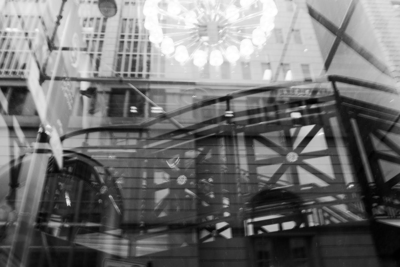
Image 1 &2: Structure 1 & 2

For these images I framed the subjects so that the buildings that are reflecting are not clearly understood as buildings. I used high contrast to to see details in the different layers of the images.

Both of these images are about windows, and the ability to see on the inside and the outside, at once.

The first image is really abstract which is much different than what I normally do I think, and I wanted to try to get into taking more abstract images.

Image 3: Urban Sprawl

I framed the image so that the fire hydrant is half hidden, but still in focus. I also wanted to capture a lot of the patterns and texture of the grass because in black and white the texture is so interesting.

This image is about how inorganic material has creeped into even places that are supposed to be considered natural. Humans have altered and disrupted the way that nature looks and lives. My goal for this image was to create an almost absurd space that did not make sense, but also had a concept about it. This work is a similar to works by Earthworks projects, except that the actual object is not made out of natural stuff.

Image 4: Gender Roles

This image is about switching gender roles, I wanted to compare people in different roles than was expected of them. I wanted people to be made aware of how uncomfortable they were when the gender roles were switched, when a man put on lipstick as a way of illuminating people's preconceived notions of gender. I framed the subjects similarly in both the images to create as little change between the two images as possible. I also adjusted the contrast and brightness similarly. This was my first attempt at constructing scenes, it was difficult because my models were slightly uncomfortable and it was hard to get them to act out my vision. This work is similar to Cindie Sherman who also puts herself in different gender roles, however my image has two different people and their interaction adds a new dimension. I wish I could have videotaped the process of taking this image too, because the posing of the models was difficult, and there was a lot of apprehension and awkwardness because of what I was asking the models to do, which I think also adds something to the concept of this image.


Friday, November 19, 2010

Final Project Proposal

I would like to make a longer series of images that related to my facebook images from the social document section.

I would like to take pictures of my friends in poses that recreate a profile picture they have had on facebook. Then pair that with an image that, in an absurd way, parodies how they behave or portray themselves on facebook (or how someone might, it does not have to be specifically about my friends). The series will be examining how a person constructs themselves and their personalities online.

I think it will have a lot of similarities with the constructed reality project as well, because I will have to create almost narratives in my images to show people's personalities.

For example, a profile picture of someone wearing a PETA shirt zooming out to show that they are actually eating meat. Or a profile picture of someone who looks like they are at a party with a friend, but the zoom out shows it is really just the two of them watching tv. This type of thing.

Constructed Reality


My biggest concern for these images is that they "make sense" because that was something that I had problems with last critique. Also, I need to edit the image of the house more, but it is taking a really long time, so I wanted to know if the concept was good before I perfected it.

Tuesday, November 16, 2010

Assignment 4: Social Document Part 2

Image 1: Containers in a Kitchen

The individuals who critiqued this photograph understood that I was trying to convey a feeling of a kitchen. The image could have been strengthened by more images in the series to imply the atmosphere of a kitchen in a stronger way.

If I were to make this into a larger project I could focus on what makes gives different locations their personality and charm, and take pictures of these individual elements to take away the context of the room, but still imply the atmosphere of the space.

Image 2: Hannah

The biggest critique I got about this image was that it was unclear about what the point was supposed to be, and that it was hard to understand what was going on. Apparently the location was hard to understand, and the fact that this image was a snapshot wasn't clear. My choices for the creation of this image were well thought-out and I planned the position and framing with care and really liked this image, so I was frustrated with this critique. Apparently nothing in this image was working well, and the choice of framing and having the figure pose created a lot of pointless ambiguity. I don't think that I would choose to do a larger project related to this.

Image 3 and 4: Facebook Profiling 1 and 2
The text and graphic elements worked well to signal to viewers the point of this image, and it was understood by everyone. One thing that people thought I could do to make it better was to add more extreme poses outside of the profile picture, to add a level of absurdity to the image. If I were to make this into a large series of work I would make a series of profile pictures (and companions) that were really absurd.

Sunday, November 14, 2010

Blog Prompt #23


In daily life, I perform in a couple ways. My job requires me to interact and be friendly to a lot of different people, so even when I'm annoyed or uncomfortable I have to pretend not to be. Also, since my job requires me to give people advice, I have to pretend to be knowledgeable even in subjects that I have no idea about.

A lot of society is constructed because it is based on the media and social networking, both of which are used to make people and things appear to be better or worse than the really are. Even the idea of my "social environment" is constructed because I have many ways to have "friends" who I can talk to, like on social networking sites, but we truly aren't friends because outside of the internet we never interact.

My physical environment was built by humans, so I guess that is the way that it is constructed. The layout of the rooms was purposefully planned by people, and the decorations and layout of the furniture was purposefully constructed by me.

I am pretty cynical, so I view pretty much every thing as constructed or fabricated, even people's interactions with me or information. There are only a couple things I think are real, and that is my own thoughts, and my religion.

I think a narrative tableau could show someone who is trying to pull off a prank getting caught.

I think it would be kind of neat to recreate images (probably really weird ones) with dolls. Like the image we looked at in class that was so strange, with the girl laying face down in the grass. Using a Barbie for that could be cool.


Thursday, November 11, 2010

Photographer Reports

Julia Margaret Cameron
Vivien and Merlin

This image was created as a book cover for Lord Alfred Tennyson's book Idylls of the King. The image is a tableau of a scene from the story. It shows Merlin being enchanted by a "harlot" named Vivien. In Tennyson's story, Vivien enchants Merlin by seducing him and using his own charm to imprison him to her. Merlin will appear dead to anyone else but her.

The image shows this specific scene in several ways, it includes in the background objects that Tennyson mentions in the story, such as the old hollow oak tree. The subject playing Merlin is also positioned to look as if he is in an unnatural trance. The subject who is playing Vivien also is positioned in a way that is very stereotypical of someone putting a spell on someone else.

Cameron uses both specific details from the story and commonly understood poses and expressions to help viewers understand the image as a tableau.

Jan Groover

Jan Groover's photographs are most often still life or landscape. A lot of what is interesting about her photographs are the abstract arrangements of her subjects.

For example, the several images of spoons and forks (all called Untitled) are easily recognizable as utensils, however the way that she has positioned these objects is very unfamiliar and creates abstract patterns within the negative and positive space. Her use of framing also adds to the abstractness because no whole utensil is shown within the frame, and it creates tension in the image.

Tuesday, November 9, 2010

Assignment 4: Social Document

Image 1: Containers in a Kitchen
For this image I filled the frame with my subjects. I also got the camera very close to get unique perspectives of objects from around a kitchen that you might not notice before.

I wanted to show different objects that do not show a kitchen but still present the idea and feeling of a kitchen. I used close-up images of familiar kitchen objects, but did not give the viewer enough context to understand the space these objects occupied as a kitchen.

I was inspired by David Hockney's work and the other artist that Sarah showed in class (the book one that she could not find a website for), so I already had this idea in my head when I started photographing. I picked out which important objects I would photograph from my kitchen, and then experimented with what ones worked. I also experimented with using a collage-type image.

My goal for this image was to try to do a "collage" of sorts, it is a type of photograph I have not yet attempted. I really liked the way that these types of images looked by the professional artists.

Like I mentioned before, I was really inspired by these two other artists. I think my image offers something a little different because both of these artists use collage techniques to show more context (by creating a space), which I have not done. It is definitely an image that is anthropological, it is showing what a kitchen is in my culture.

Image 2: Hannah
This image is a snapshot. The image was carefully framed with the subject in the foreground and most of the background eliminated. I thought that the background might draw too much attention if most of it was shown.

The image is about the subject, Hannah. I told her, I was going to take a picture of her, and that is how she posed. I believe the image shows a lot about her personality and also a lot about the environment that she lives in, because you can see in the background her bedroom.

It was a snapshot, so I did not do much in terms of method, I just told the subject that I would take a picture of her. I used overhead lighting.

My intention for taking this picture (and the others related) was just to show my friends and how they behave in their "natural habitat".

This image relates to Martin Parr's work, because he also takes images of people just doing what people do. My perspective for this image is slightly different because I have a friendship with the subject, and tried to capture the essence of her in a slightly more deliberate way than just taking shots of strangers.

Image 3 & 4: Facebook Profiling 1 & 2

Both of these compositions include two different perspectives of a subject. Each composition includes an image where the subject fills the frame and also an image where the subject is only a small part of the frame.

Both of these compositions are exploring the absurdness of the idea that you can really know and be friends with someone through social networking, and more specifically that you can really know who someone is by their profile picture. For these compositions I took pictures of the subject in very typical profile picture poses, and then zoomed out to give this pose more context.

For these compositions I used the new lighting technique to bounce light to both sides of my subject. I also added text to the image for the first time.

My goal for this image was to be a little funny, but to also make a statement about social networking.

I'm not sure how my photos compare to other artists. These photos definitely make a social statement, and maybe even an anthropological one as well.


Tuesday, November 2, 2010

Assignment 3: Place Write-UP Part 2

1. Onlooker
People interpreted this image differently than I imagined. I got several suggestions saying that I should make the horse and carriage and the boy more of the focus of the image so that the image would become more about the . To do this, I might crop out more of the sky and grass.

If I were to make this image into a larger project, I would try to take pictures of people in different locations from far away to examine their postures and the relationship of movement between each other.

2. Duality of Suburbia
During the critique, people understood that the image was about suburban life and the lack of individuality within it. The image was successful in being interesting, however it was said that the sidewalk patterns gave away the fact that it was edited. To expand this image into a bigger project I could take most pictures in neighborhoods looking for things that are identical.

3. Preservation Area
People understood that the image was ridiculous but they did not understand that I was trying to make it seem like the sign was for the neighborhood. I believe I lost some of the midtones when I printed the image, so I think I should try to make the contrast less extreme. I could expand this in way that is similar to image number two.

4. Structure
People could understand this image as well, most people thought it was about man-made objects. In order to help push this concept I should straighten the building in the frame, and get rid of the tree.

In-Class Critique